Peachy Keen Popsicles
Designing a responsive website to create new revenue streams
Overview
Client: Peachy Keen Popsicles
Role: User research, Strategy, UI Design, Prototyping, Testing
Timeline: 8 weeks
Tools: Figma, Maze, Octopus, Adobe Express
Problem
As a mobile business, Peachy Keen depended heavily on favorable weather conditions, bustling crowds and social media for sales. However, the business faces challenges during difficult weather, resulting in a significant sales downturn. The existing website primarily focuses on showcasing products and lacks functionalities to capitalize on additional revenue streams, such as facilitating delivery orders, providing comprehensive wholesale information, and streamlining the event booking process.
Solution
Design a responsive website connecting local community to Peachy Keen and incorporate user-friendly features for online delivery orders, providing detailed wholesale information, and streamlining the event booking process.
Research
Competitor Analysis
The goal was to identify Peachy Keen’s competitors- both locally and in the healthy frozen treats industry.

Click to enlarge
Common strengths among competitors include:
-
Personal story
-
Product Information (transparency)
-
Where to find
-
Contact
-
Mission/values
User Interviews
The first goal was to understand why Peachy Keen is so weather dependent. In this first part I interviewed everyday consumers to understand buying behaviour.
The second goal was to empathize with wholesalers, small business owners and parents to determine their goals, and any pain points. I gathered my findings into an Affinity Map to help uncover common threads:

Click to enlarge
Key Insights
-
Consumers buy popsicles if it’s convenient, appealing, healthy & local
-
Users seek detailed information about the product before purchasing
-
Users are more likely to order/buy a popsicle if there are images and is appealing
-
(Most) Users rely on online reviews.
-
Business owners or event planners enjoy the ability to customize their order
-
Business owners get frustrated when the order or booking process is confusing and lacks confirmation and tracking
Target Audience
Using insights and patterns discovered from my interviews, I developed two personas:
Objective
How might we design a website for Peachy Keen Popsicles that provides detailed business and product information, facilitates orders and event booking, and fosters community?
Ideation & Prioritization
After gathering insights and setting the objectives, I created and prioritized a list of features to be included in the design. The metrics used to measure priority level were confidence in value, design effort and goals.
Information Architecture
Site Map and User Flow
With a strong understanding of our users and their goals/pain points and priority list, I moved on to creating the site map and the user flow. I constantly referred back to my research notes to help me through this process.

Click to enlarge
For the user flow, I focused on the following three tasks based our users goals and needs.
-
Learn about Peachy Keen, what do they do? How? Who? Why?
-
Book an event
-
Reach out to wholesale.
-
(Add Popsicle to car was later added when designing)

Click to enlarge
Wireframing
Low/Mid Fidelity
I started off my making sure I had key screens: Home, About, Products, Contact, Events.
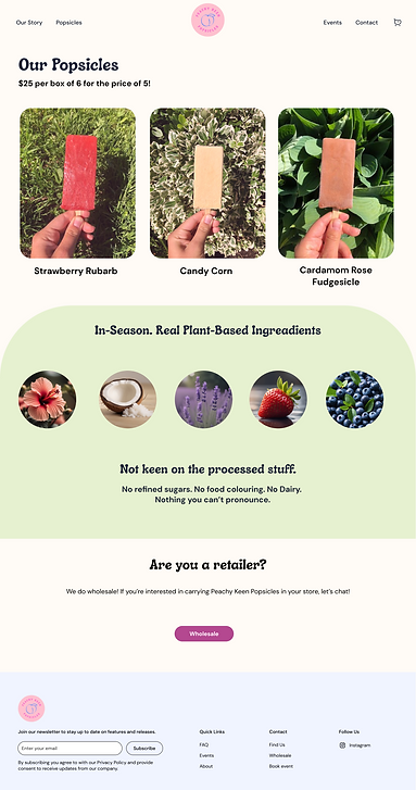
Homepage
About
Product page
Product

Events
Contact
Click to enlarge
Hi-Fi and Protoyping
I built the high fidelity prototype using Figma. Due to timeline, scope and budget, I focused on the tasks stated in previous section.
How might design a website that fosters community and conveys the brand's story and values?
Landing page highlights products, values, activities, provides a social wall and includes FAQ section.
Our Story page includes a video that shows the personality of the business, more information on the back story and what inspires and drives Peachy Keen Popsicles.


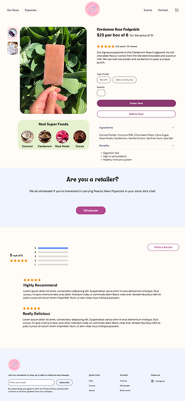
How might we provide user with access to information about the product sold?
Images
Ingredient spotlight


Star rating & Description
Ingredients & benefits
Reviews
How might we facilitate the ordering or booking process?
Form in
Events page
Calendar View


Contact form for any inquiry
This banner appears throughout the website
Overlay opens for wholesale inquiry


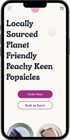
Mobile Screens


Testing
Next, it was time to put the prototype to the test. I conducted unmoderated tests via Maze.
Objectives:
-
Observe how users complete tasks
-
Discover any issues with design
-
Discover pain points of users
-
Determine users’ feelings towards look and feel
Tasks:
-
After seeing a post about a local popsicle business, you are interested in learning more about Peachy Keen. Your task is to find detailed information about the company, and its story.
-
You are interested in booking Peachy Keen for a catering event. What steps would you take?
-
Imagine you are a wholesaler looking to carry Peachy Keen popsicles into your store. How would you do this?
-
You want to add to cart: 1 box of the cardamom rose fudgsicle
Insights
100% of the users were able to complete all tasks. Some additional key insights I received were:
Our Story Organizational Structure
As 'mission and values' are key details, it was recommended to move these sections to the top as opposed to the bottom.
Adding to cart from main products
Returning users enjoy option to add to cart from all products page as they don't need to learn more details.
Iterations
Our Story Organizational Structure
Per testing insights, Mission & Values were moved to the top. I also changed the orange colour to scale the other colours and changed the footer colour to create seperation,
Before

After

Adding to cart from main products
Instead of entering each popsicle's page, the user can now add to cart from main product page. Since Peachy Keen Popsicles only delivers boxes of 6, the user is given the opportunity to create their own box. This feature was also added from an individual popsicle's detailed page.

Added hover 'ADD TO CART' to the product component

At the top of the page, the user can now add more popsicles to create their own box. ADD TO CART is disabled until 6 popsicles are selected.

6 popsicles have been selected and thus button is activated.
Reflections & Future Plans
Due to a low budget, the difference between my ideas and what could realistically be executed should have been more strongly considered during ideation. As this is a new startup with only one season under its belt, I think this design is a great start and will help the business grow. The website is purpose driven and I believe the future impact will be successful because of that.
Predicted impact:
-
Increase in number of orders
-
Increase in wholesale inquiries
-
Increase of event booking inquiries
-
Increase of brand awareness among Halifax local community
Future areas of exploration
Once growth is seen and budget increases I would love to explore:
-
Account creation
-
Automatic wholesale order
-
Automatic booking process
-
Order tracking


