Project Type: Contract
Industry: Automotive
Timeline: 8 Weeks (for MVP)
Team: Developer, Engineers, Product Manager
Role: Product Designer
Research, ideations, wireframes, user flows, prototyping, usability testing, UI, design system, handoff
Project Satus: Expected to ship in Q4 2024
History of the car key
Over the years, the ‘car key’ has had many technological advances.

Source: CHRIS AMOS AND ROY RITCHIE via Car and Driver
They key as we know it, will most likely be obsolete in the future. Modern companies such as Tesla, or evolving companies such as Mazda or BMW have introduced the smart phone as the new car key. Not only can the smart phone control the car, but it can also allow the owner to share their car. This is done as newer models are rolled out.
The Challenge
As newer vehicle makers and models emerge with the smart phone key, a physical key proves to be inefficient and inconvenient. However, these technologies only support limited and new car models. Smart Control's patented technology aims to enable car control and sharing for people with any car model.
The Solution
Design a mobile app that allows users to manage, control and share their vehicle in a way that is tactile, convenient, efficient and secure.
Control Vehicle

Share Key

Monitor Drivers

Objective
How might we create an app that makes the controlling, sharing and borrowing processes feel efficient, convenient and safe?
Meeting with client and engineering team
As I am new to the automotive industry, and the technology involves a hardware, I met with the team to thoroughly understand how this can work and define existing limitations.
Important car/key setup steps:
-
The user manually inputs their car information
-
The user must turn on their bluetooth and pair with the car
-
Once paired, the user must calibrate for best performance
-
The user should be able to customize their key
Limitations
-
We cannot be certain of lock status of the car- but we can know if a command was received.
Target audience
-
Any user that wants to drive their car and never carry a key
-
Any person who wants to share with friends/family
-
Any person who wants to share or borrow a car
-
Small business owners
Discover
What are car keys and app keys like today?
In order to gain a deeper understanding of the current landscape I set my research goal:
Determine what and how similar products (car keys or mobile apps) are designed and function, who its users are, and what they like and dislike.
1
Competitor Analysis
Traditional Keys
Key Fobs
Smartphone Wallets

Tesla

BMW

Mazda
I conducted a competitor analysis in order to identify other products on the market, what they do or don't do well, and potential opportunities. It was clear that most importantly, users wanted their key to be simple, tactile and responsive. In addition, it was crucial for the product to have an easy setup.
To read the full analysis click here.
2
User Interviews
Next, I conducted user interviews. This allowed me to dive in and gain a deeper understanding of the pain points and frustrations people have when they are using their car, sharing their car or borrowing a car. In order to get a 360 understanding, I wanted to interview a variety of users. After all, many different people drive cars under different circumstances.
I interviewed 6 participants of whom fell under the category of at least 1:
-
Currently uses an app to control car ( Tesla, BMW)
-
Currently owns a car and uses traditional key/fob
-
Shares car(s) with members of the same household
-
Shares car(s) with family/friends outside the household
-
Have borrowed cars
-
Have rented their car out via car share
-
Parents, adult children, singles, partners
Below, I synthesized interview findings using and Affinity Map. I found six common themes from participants deriving from pain points, worries, frustrations, motivations, wants ect.
Affinity Map

Click to enlarge
3
Secondary Research
I conducted Secondary Research on Fleet Management systems to learn about their small business and fleet owners' pain points.
Key Insights
-
Users want their car key to be simple, tactile and responsive
-
App works best with simple setup
-
Concerns about trusting others with car not to speed or go to unwanted location
-
Participants said they were most likely to use an app and carshare if there were customizable access levels
-
Participants who are currently using an app as key are unaware of share feature because it is not obvious
-
Participants who are currently using an app rarely-to-never take out app
-
As a fleet manager- not knowing who has access to which car is frustrating
Define
Who are we designing for?
Using information from my stakeholder interviews and user research, I created three different user personas to define the different types of users, their motivations, goals and frustrations:

“Coordinating car usage among my family is like a juggling act!”
“I try to carry the least amount of items, I don’t like carrying bulky things- just my phone as much as possible”
"Efficiently managing my business fleet is key. Sharing cars with family during downtime keeps it all running smoothly."
Click to expand
How Might We?
Using these three personas- I came to three important design questions:


Ideate
To answer the How Might We’s, I decided to focus on the following areas:
-
Home screen with car controls should be tactile- long press, vibrations, responsive feedback
-
Simple, easy to follow set up car process
-
Ensure sharing car is obvious, clear and easy.
-
Introducing customizable access controls and include speed limit (and geo fencing in the future).
-
Troubleshooting
Checking in with the Team
When I ran by the focus areas, I received some updates:
-
Speed Limits and Geo Location is something they want to do in the future but will not be included in first launch. Despite this, I did include speed limit to see how that could work.
-
We cannot know forsure that the car is being driven which also means we cannot know who is driving the car. We can know which driver last had access to the car.
-
Valet: An Aux remote that the app can turn on/off. Important: The command can always be sent but in order for the valet to be turned on/off the phone must be in range. Thus 3 states: On/Pending/Off. At this point I reached back to my participants to understand their experiences with Valet.
App Structuring
Primary Owner vs Secondary User
When mapping the app out, I considered the two different kinds of users. Primary Owner (the owner of the car) and the Secondary User (the person borrowing or renting the car). Because a user can be a Primary Owner for one car, and a Secondary User for the other, we settled on using the same structure. The only difference is that 'Share' has less features for a Secondary User.

Click on image to expand
Primary User

Secondary User

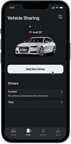
Both images above are screens for car sharing. In the first image (left), the primary user can add new driver, and view or manage current and past drivers. On the other hand, the secondary user (right) can view their access period, owners of their car and restrictions set.
First Flow creation
Although this changed as I got through wireframing, this flow was my starting point for achieving my focus areas of:
-
Setting up
-
Adding a car
-
Sharing car
-
Setting restrictions

Click to enlarge
Prototype
Wireframing
Before starting to build out wireframes, I looked at other apps in the industry. I particularly noticed that a lot of the home pages were super busy, and setups could be complex. When sketching my wireframes, I really tried to focus on simplicity and ease of use.
Mistakes I Learnt from
-
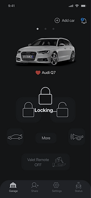
As seen in the second image, I created buttons that were too close together. Although these are mid-fi, it wasn't much thought about until discussed with my team.
-
When dealing with complex processes, wording is super important and can disrupt the entire flow

Look and Feel
The client wanted the app to look and feel simple, sleek and modern. I coordinated the iconography with a graphic designer.
Color Palette
Primary
Secondary
EDF0F5
DAE2ED
8D939B
46484B
2D3136
1C1E20
Primary Text
Background
2B89E7
B7382F
Accent
Error
54C760
Success
Typography
SF Pro Display Bold
SF Pro Display Regular
Components
Buttons

Calendar

Navigation & Iconography
Enabled
Disabled
Tabs

Day Picker
Progress Bars

Inputs

Selections

Testing
Putting our solutions to the test
Here is a summary of insights gained from usability testing:
-
Adding a second car:
-
40% did not tap correctly on the first tap
-
Insight: add “Add Car” to make button more clear
-
-
Editing Valet mode settings
-
40% users did not tap correctly on the first tap
-
-
Testers found the Dashboard vs Settings layout confusing
-
80% had direct access in the case of an error- tapped on connection button not help
Iterating & Final Designs
Taking the results into account along with feedback and collaboration from the team, I focused iterations on the Garage screen.
Garage

First Design
'Add Car' is more clear
.png)
Favourite Car for Default
Swipe for more cars
Notifications
Drawer opens for more keys if user chooses
User can check connection status
Valet Button with Status
(Settings was removed to keep it simple)
Final
Simple, Responsive and Tactile


Press to hold, once command is received, message is displayed and then reverts back to normal.
Press to hold & vibrating button.
When car is out of range, the buttons darken to signify they won't work. If the user taps anyway, a message will appear.
Easy-Guided Setup


In order to make the setup as smooth as possible, we broke it down into four steps. Each step has a brief explanation and tells the user how much time each step will require. Each step has clear instructions, and uses a progress bar and check marks, telling the user the stage they are at in the process.
Customize Key
Clear instructions
Selected
Unselected
Option to keep default


User is notified new key is created and instructed on how to use.
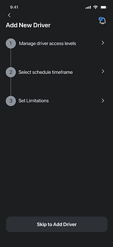
Inviting Driver with Customized Access Levels

Clear steps set

Information icon to explain the access levels

Radio buttons indicate only one option can be selected

Easily select Start and End dates and time.

Additional control settings
Next Steps and Lessons Learned
Future plans include:
-
Introduce speed limits
-
Introduce geofencing
-
Introduce Help/FAQ page
Learnings:
As I worked as the sole designer in conjuction with engineers, I learnt a lot about communication. At the stakeholder meeting I asked helpful and insightful questions but as time went on- more and more questions popped up. Some - I would ask the wrong person, who would then ask someone else and get back to me eventually, and then another team member would interject with a different response. Looking back I would definitely go to the source or ask in an open email chain to ensure that everyone is on the same page.


